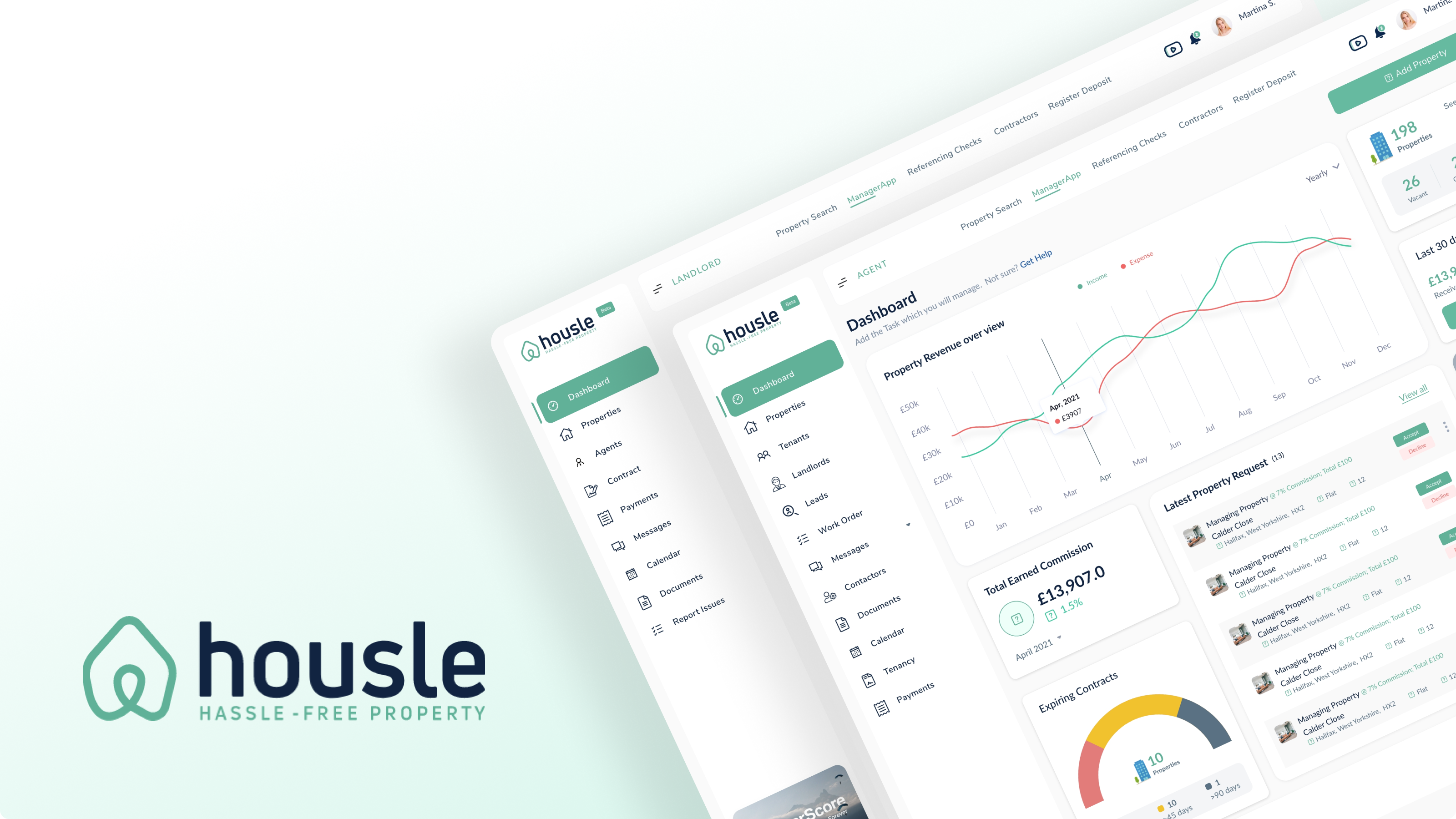
Housle is a real estate PropTech SaaS serving both sides of the property market: estate agents managing listings and client relationships on one hand, and property buyers and renters searching and transacting on the other.
I led 0→1 UX/UI design for the full platform, building a reusable component library and design system that gave both surfaces a unified visual and interaction language while serving very different user goals.
The central challenge was workflow complexity. Estate agents deal with long-running, multi-party transactions, properties move through many stages, multiple stakeholders communicate, and document management is a constant friction point. The design needed to surface that complexity intelligently without overwhelming either side of the market.
Post-launch analytics tracked a 35% workflow efficiency gain for agents and a 28% increase in user engagement on the consumer side, both driven by clearer information hierarchy, better navigation, and usability improvements uncovered through iterative testing.
Before any screen took shape, I needed to understand how a single property moves through the system from two completely different seats — the agent managing it, and the buyer or tenant trying to secure it. Agent shadowing, tenant and buyer interviews, and a competitive audit of existing PMS tools shaped every structural decision that followed.
Sat with estate and letting agents observing how they actually managed live work orders, tenant communication, and contractor coordination day to day — not how the old tools assumed they would.
One-on-one interviews with people mid-search, focused on the exact moments they lost trust in a listing or gave up partway through an enquiry or application.
Mapped existing property management tools and consumer property portals side by side to see exactly where the agent experience and the consumer experience diverged across the market.
Work orders lived in email and WhatsApp. Agents chased contractors for status updates outside the system, then re-entered progress by hand.
No single view of a property's lifecycle. Listing status, tenancy details, and maintenance history sat in separate tools and spreadsheets.
Document chasing was manual. Referencing paperwork and signed tenancy agreements were tracked outside the platform, with no shared source of truth.
Search felt disconnected from reality. Listings were often stale or already under offer by the time a buyer or tenant made an enquiry.
No visibility after an enquiry was sent. Buyers and tenants had no way to check referencing or application status once they'd submitted it.
A trust gap with agents. Consumers couldn't tell which agents would actually respond before committing time to booking a viewing.
Both sides of Housle run on the same underlying transaction, seen from two different vantage points. Standardising property, work order, and tenancy as shared objects — rather than screens with duplicated logic — is what let each surface stay simple without the other getting more complex.
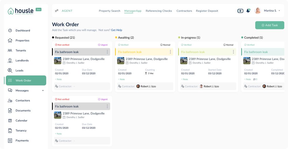
Every maintenance request as a Kanban card moving from Requested to Completed, with a verification step and a named contractor attached — replacing the spreadsheet-plus-inbox setup most agencies were running on.
Four-stage pipeline — Requested, Awaiting, In-progress, Completed — visible at a glance
Verified / Not verified status and urgency flags surfaced directly on the card
Contractor assignment and due dates tracked without leaving the board
The view a landlord opens first — portfolio health and income in one glance, with the properties themselves and who's managing each one just below.
Portfolio snapshot — listed properties, total units, vacancies, and last month's income as four glanceable stats
Income vs. expense chart plotted month over month, not buried in a report
Managed-by column on every property, so it's clear which agency is responsible
New leads arrive as a single reviewable queue instead of scattered enquiries, so an agent can accept or decline in one action and know exactly what it's worth before committing time.
New / Successful / Unsuccessful tabs keep the lead queue from turning into noise
Earnings shown per lead before the agent decides to accept
One-tap Accept / Decline instead of a multi-step response flow
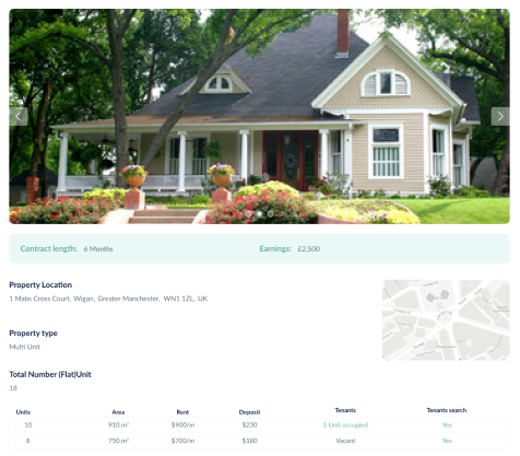
The tenant side of the same platform, built around the handful of things a tenant actually logs in for: paying rent, finding a document, or reporting something broken.
Rent due and Pay Now surfaced at the top, not buried in a menu
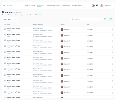
Documents and tenancy agreement attached directly to the property card
Report Issue shortcut that feeds straight into the agent's work order pipeline
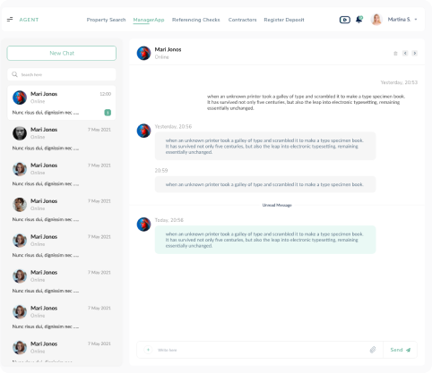
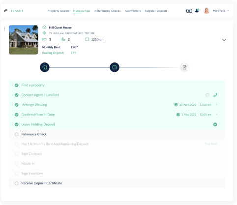
One account-type screen splits every new sign-up into the right experience, then carries them through referencing and deposit as a visible progress stepper instead of a black box.
Single role-selection screen — Tenant, Agent, or Landlord — routes the rest of onboarding
Referencing & deposit stepper shows exactly which stage an application is at
Landlord and tenant list views give agents a single admin surface for both
Color, type, spacing, and elevation defined once as tokens and applied consistently across the agent dashboard and consumer marketplace, despite their very different tones and information density.
Cards, forms, navigation patterns, and listing components were built once and reused across web and mobile, B2B and B2C, keeping the platform visually coherent as new screens were added.
Structured handoff specs with naming conventions that matched in Adobe XD and code, plus lightweight component versioning, kept QA cycles short and engineering velocity high as the platform scaled.
Navy carries text and structure; teal is the primary mark color; slate, coral, yellow, and lime are reserved for accents, status, and icon fills. Navy and slate are the two that clear accessible contrast directly on white — the rest are tuned for dark surfaces, large type, and UI fills rather than body copy.
Lato carries every heading and body size on the platform. Nunito Sans is reserved for the navigation menu's active and inactive states — a small, deliberate split that keeps reading content and wayfinding visually distinct.
Everything below is rebuilt with the system's real tokens — not icons standing in for them. Navigation, buttons, status pills, cards, and tables all trace back to the same six colors and two typefaces shown above.
| Issue | Status |
|---|---|
| Bedroom Screen | Tenant Req. |
| Heating Check | New |
The 35% and 28% figures are proof the underlying model was right, not just that individual screens improved. Standardising property, work order, and tenancy as shared objects — rather than screens with duplicated logic — is what let a single component library serve the agent dashboard and the consumer marketplace without either one dragging on the other.
The hardest design decision was information density. Agents wanted to scan a full pipeline at a glance; buyers and tenants wanted one calm decision at a time. Reusing the same components but giving each surface its own layout rhythm, rather than forcing one grid onto both, is what made the shared system feel native on each side instead of compromised on both.
One honest gap I'd close next time: a few of the brand's accent colors don't clear accessible contrast directly on white. I used them correctly — tinted fills and dark surfaces only — but I'd push earlier for that constraint to live in the tokens file itself, next to the color, rather than in my head.
Shared data model, not shared screens. The two surfaces stayed visually consistent because the objects underneath — property, work order, tenancy — were the same, not because the layouts were forced to match.
Density is a decision, not a leftover. Letting the agent side run dense and the consumer side run spacious, using the same components, was intentional — not a compromise between two audiences.
Reusable components compound. The shared icon set and component board are what kept the 35%/28% gains consistent instead of the two surfaces drifting apart after launch.
Document contrast rules with the tokens. Accent colors that only work on dark surfaces need that constraint written down next to the color, not just followed correctly by habit.
Structured handoff specs with naming that matched between Adobe XD and code kept QA cycles short as the agent dashboard and consumer marketplace shipped in parallel.
One shared component board serving two products with very different density and audience kept the design library navigable as new work-order and search features were added.
Post-launch analytics and follow-up interviews validated the 35% and 28% gains and directly informed the next round of navigation and document-workflow fixes.